Use different menu items for different device sizes
There are situations where you may want to have a different menu item on a specific device size. Below it's how to manage that by displaying and/or hiding the menu items based on the device screen size.
The first step is to add some CSS snippet in your Theme Theme Options > Custom CSS. It's is highly recommended to use a child theme or and CSS plugin.
Below is the snippet code. Paste the code in your Theme Theme Options > Custom CSS or your CSS plugin.
/* Hide element on Desktop */
@media only screen and (min-width: 981px) {
    .hide-on-desktop {
        display: none !important;
    }
}

/* Hide element on Tablet/Phone */
@media only screen and (max-width: 980px) {
    .hide-on-mobile-tablet {
        display: none !important;
    }
}
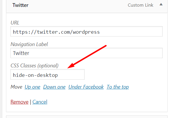
Once added, you just need to add the CSS class below on the menu item that you want to hide on Tablets and Phones (less than 980px) or adjust accordingly:
hide-on-mobile-tablet
And use this CSS class on the menu items that you want to hide on Desktops:
hide-on-desktop
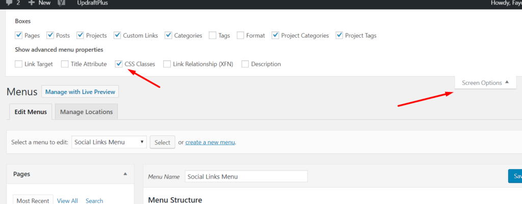
This is where you need to add it to:
NOTE: If the "CSS Classes" field is not visible in your Appearance > Menus screen, open Screen Options (top-right corner) and tick the checkbox to enable it.